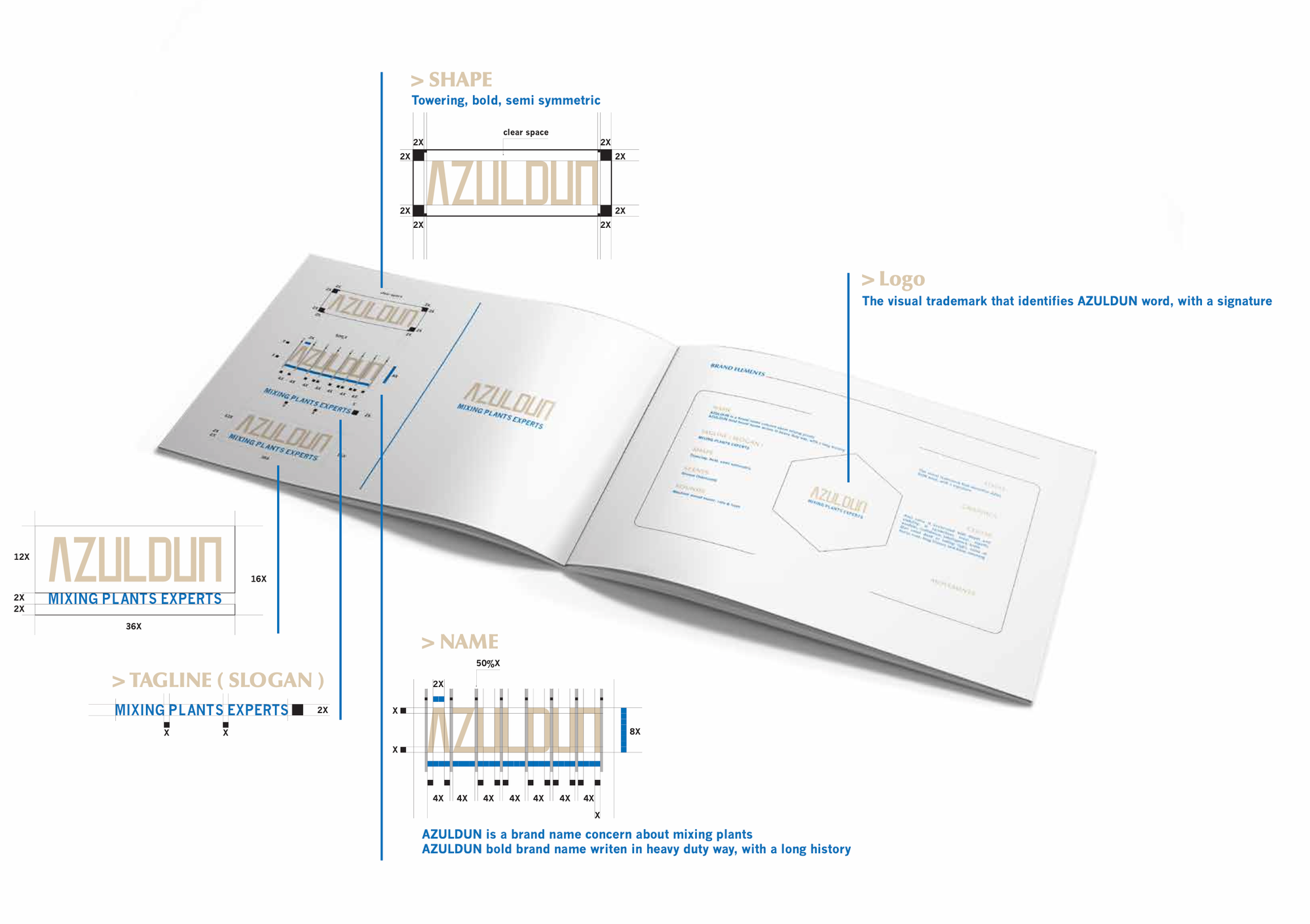
Building AZULDUN’s Logo with Purpose
AZULDUN is more than a name. It’s a signal of expertise in the mixing plants industry. In this post, we explore how we built a brand identity from the ground up—starting with a Brand Identity Prism, imagined guidelines, and a logo that speaks with clarity and strength.

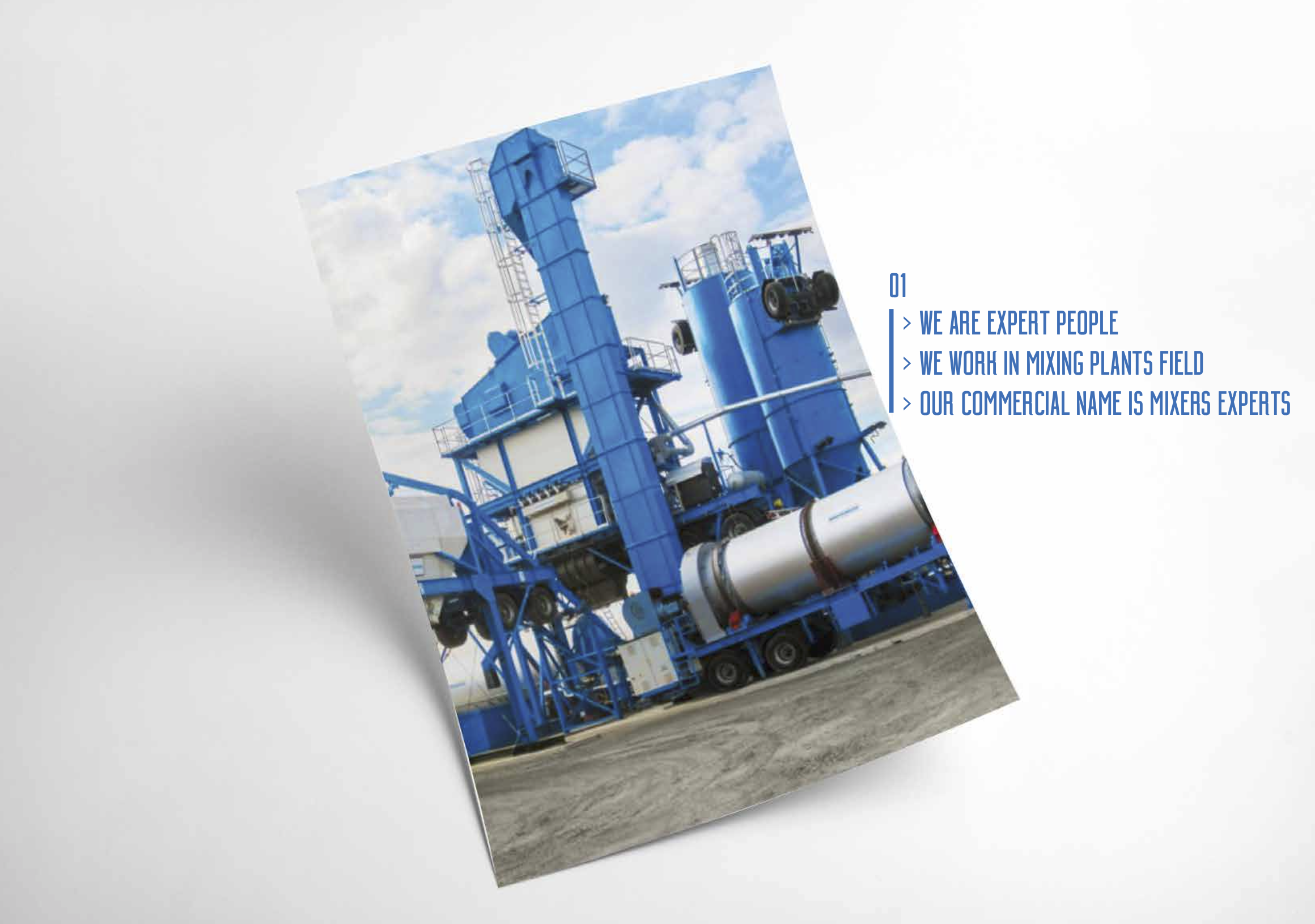
AZULDUN, or rather, as they are commercially known, MIXERS PLANTS EXPERTS, required more than a logo. They required a narrative told—and told well—one of experience, courage, and readiness in the mixing plant universe.
The work scope was: A logo, A simple brand guide, and Simple stationery
Step 1 — Clarify Through the Brand Prism
You don't design logos. You design meaning.
To ensure each design decision is intentional, we began with a Brand Identity Prism. Here's how AZULDUN's brand came to life through it:
- Physique
Visual Anchor: Horse — resonating agility, speed
Recognition: Industrial, rugged, yet precise
Function: Used in heavy-duty, high-performance applications
- Personality
Professional, structured, confident
Speaks like an expert, reliable partner
Communicates both heritage and technical expertise
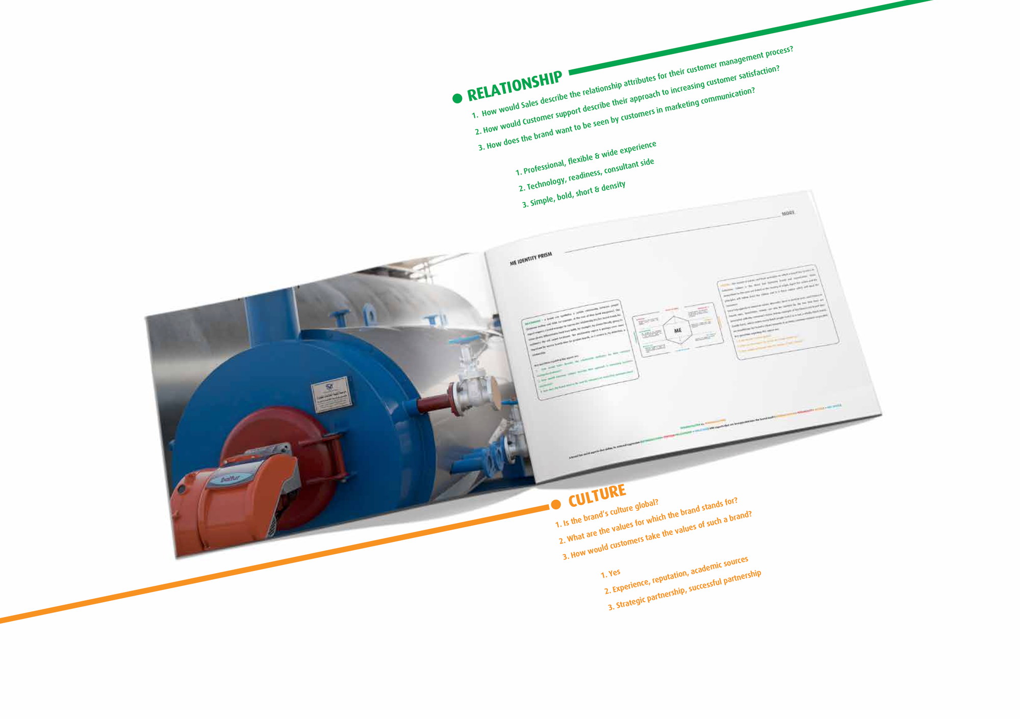
- Relationship
Sales orientation: Long-term partnership
Customer service: Knowledge-based, reliable, solution-oriented
Perception desired: Successful and strategic partners
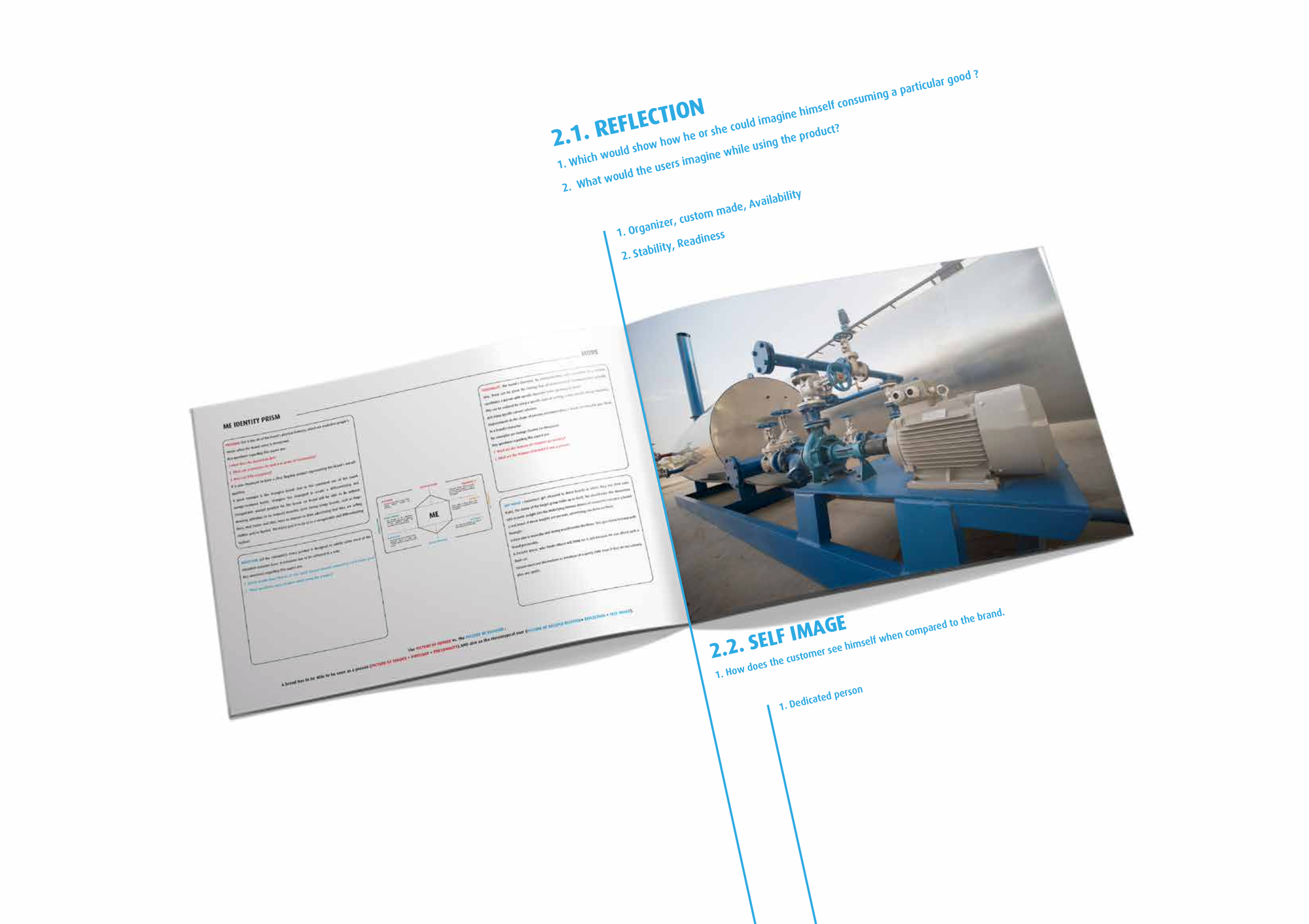
- Reflection & Self-image
For users: Systematized availability, reliability
Self-perception: An expert, dedicated mixing solutions partner
- Culture
Values: Strategic renewal, readiness, precision
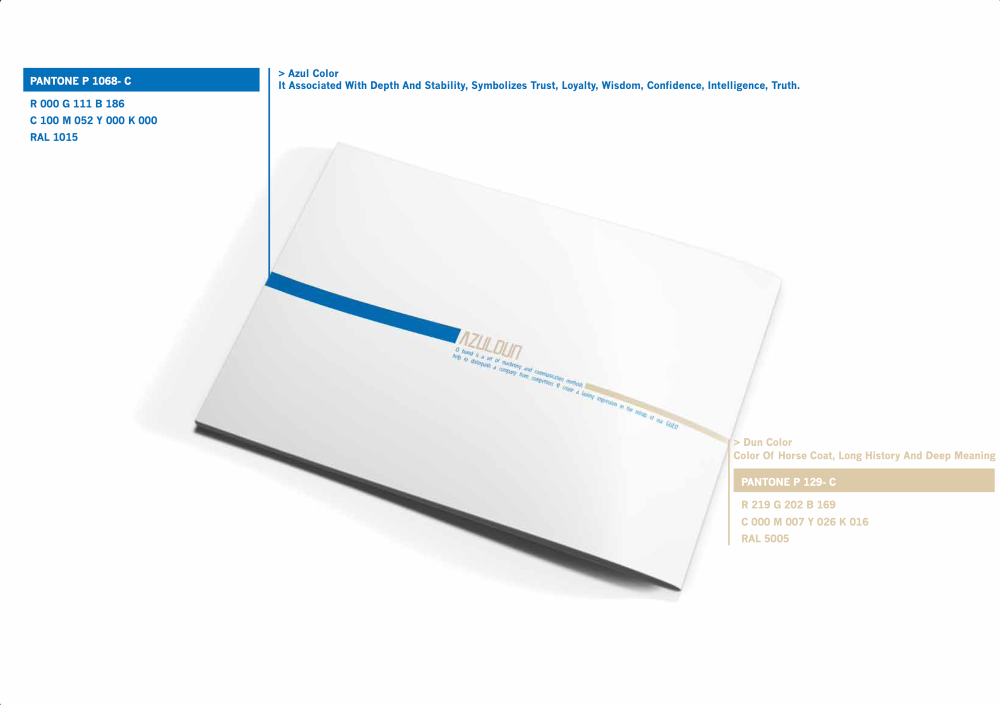
Color palette:
Azul Blue = stability, depth, Dun (Horse coat beige) = trust


reliable & readiness = trust & stability
Step 2 — Turn Curiosity Into Action
We imagined AZULDUN not as a company, but as a character:
- Old-world expertise
- Modern performance
- Unwavering confidence
From that vision, design began. The wordmark was typeset in a heavy-duty custom typeface—nearly as if it's cast in steel. Curves referenced mechanical balance. An upright stance referenced strength and clarity. Symmetry referenced strategic control.
We explored how to turn abstract values into functional branding.
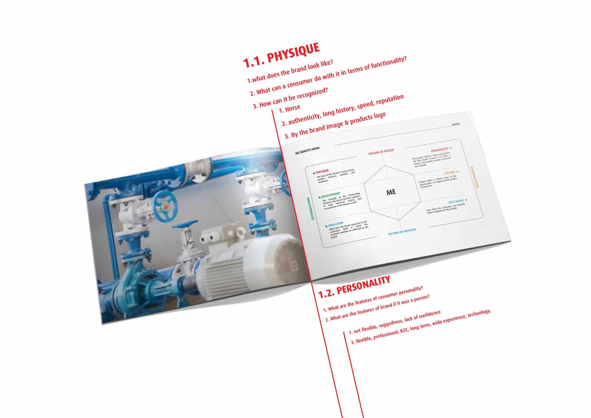
brand prism visualizes a brand's identity through six distinct facets: Physique, Personality, Culture, Relationship, Reflection, and Self-Image.
Step 3 — Minimize Distractions and Deliver with Focus
The logo system was created to be:
- Scalable across print and screen
- Bilingual (Arabic-English), versatile
- Stationery-friendly with clear space and good margins
We didn't over-design. Instead, we focused on boldness, legibility, and recognizability—especially for engineers and contractors.
Step 4 — Delivery
Final Package Included:
- Logo (main, reversed, mono)
- Margin grid and clear space
- Brand marks and tagline
- Color codes (Pantone, CMYK, RGB, RAL)
- Basic stationery templates: letterhead, envelope, business card
boldness, legibility, and recognizability—especially for engineers and contractors
Lesson Learned:
From Clarity to Craft. From Vision to Delivery. In industrial brand design, storytelling must be backed by structure.
With a Brand Prism in hand prior to ever touching design tools, we could translate strategy into form.
Final Thought
AZULDUN isn't a name. It's a declaration: We are mixers experts. We are driven by purpose.
That's how identity gets made—not as decoration, but as direction.